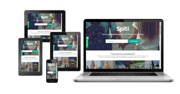
In the modern world, where users access a website from different devices, responsive design has become not a luxury, but a necessity. A responsive website automatically adjusts to the screen size, ensuring ease of viewing and interaction on any gadget.
Why is responsive design so important?
Increased traffic and conversions: Users who feel comfortable using your site spend more time on it and are more likely to make an order or leave contact information.
Increased rankings in search results: Google and other search engines give preference to sites with responsive design.
Create a Positive Impression: A responsive website demonstrates professionalism and attention to detail, which positively impacts the perception of your brand.
How to create responsive design?
1. Choose the right development platform:
Webflow: A visual editor with a simple interface that allows you to create responsive websites without knowing any code.
WordPress: Popular CMS with a wide selection of plugins and themes, including those that support responsive design.
HTML and CSS: To develop from scratch, you will need knowledge of HTML and CSS.
2. Use responsive layouts:
Grid and Flexbox: These tools allow you to create dynamic layouts that automatically adjust to different screen sizes.
Media Queries: Use media queries in CSS to customize styles based on screen size (e.g. font size, column width, element layout).
3. Optimize your images:
Use JPEG or WebP for images: These formats allow you to maintain the quality of your images in a smaller file size.
Reduce image size: Use tools to compress images without losing quality.
Use Responsive Images: Webflow and WordPress have the option to use responsive images that automatically adjust to fit the screen size.
4. Test the site on different devices:
Use tools for testing responsive design: Google Chrome DevTools, Responsively.app.
Test the site on mobile devices: Test the site on various models of smartphones and tablets.
Get user feedback: Ask friends or colleagues to test the site and give you feedback.
5. Additional recommendations:
Simplify navigation: Ensure that site navigation is intuitive on any device.
Use contrasting colors: Make sure the text is clearly visible against the background.
Reduce the amount of text: Make text more concise and readable on mobile devices.
Use buttons of sufficient size: Make sure the buttons are easy to press with your fingers.
Conclusion
Adaptive design is the basis of a successful website in the modern world. Follow these simple steps to create a website that will work for users on any device.